Carepath
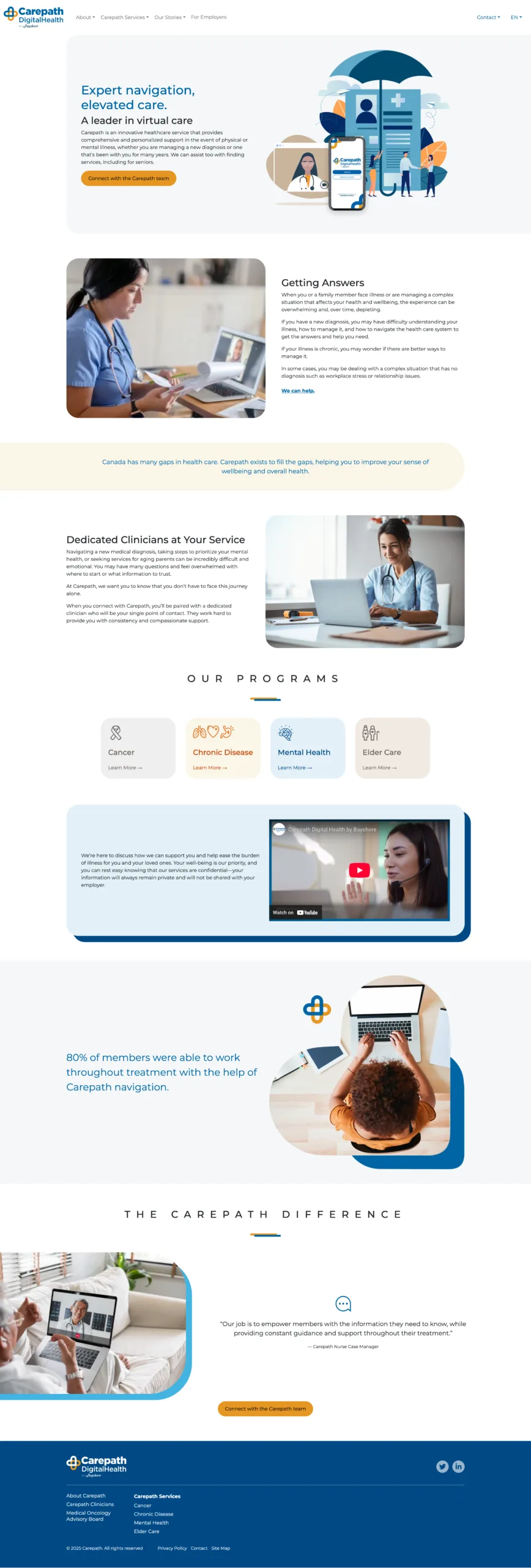
Carepath needed an updated website felt modern and reflected their established brand identity. They needed the website to look good, have up-to-date information, intuitive UI, easy navigation, and be easy to maintain/update.
Designing Around an Established Brand Identity
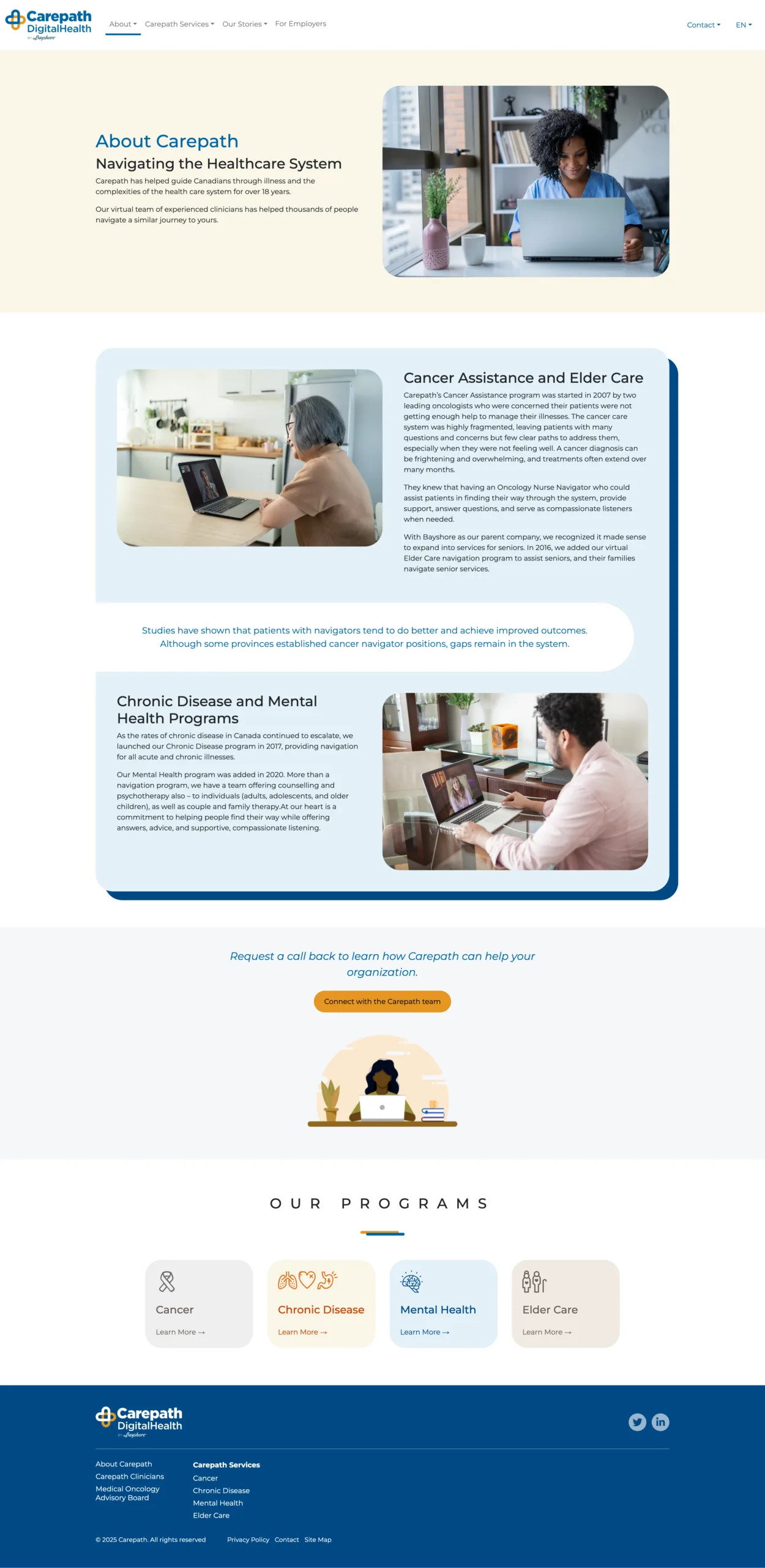
Rather than creating a new visual identity, the focus was on building a website that felt true to the brand Carepath had already established, and their reputation in the health care space. The redesign brought a more modern and polished experience while keeping the brand recognizable and consistent.
Colours
Blue
#0065A4
Gold
#E59622
Pale Blue
#E3F1F8
Background Gold
#FAF6E8
Background Taupe
#F0EBE3
Light Gray
#EFEFEE
Fonts
Montserrat
Tempor orci maecenas tortor vitae. Eget duis egestas pharetra vitae convallis adipiscing. Vel eu elementum magna nunc cras sapien nec. Lectus rhoncus tellus vel nec porta non dui in.
Buttons
Icons


Logos





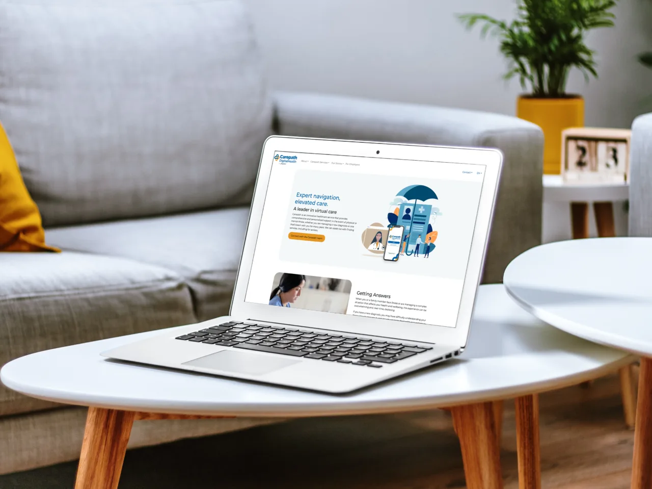
What we delivered:
- Modern, custom professional design
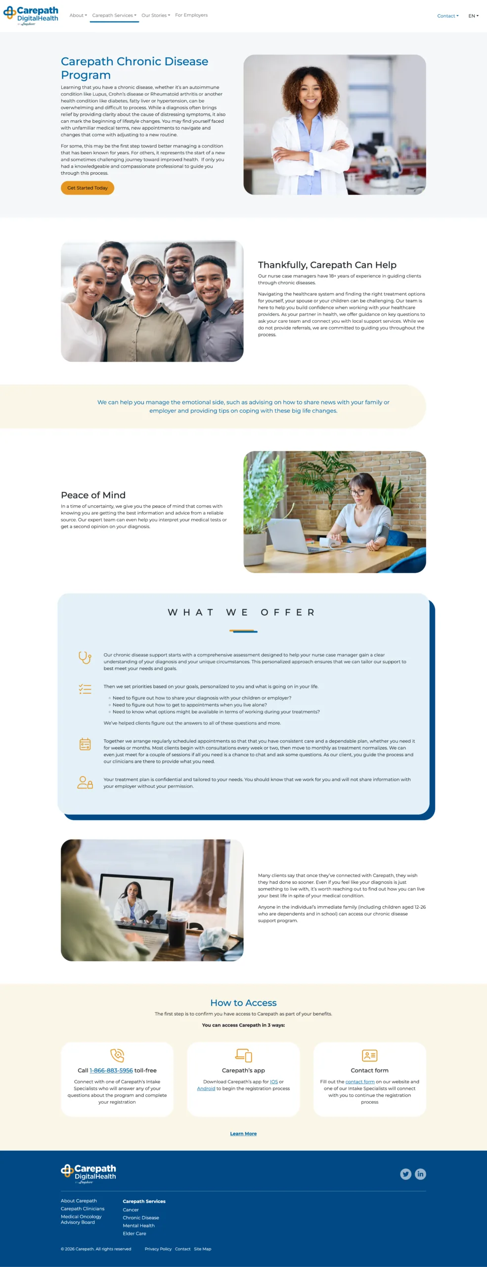
- Consistent branding applied across all pages
- A flexible WordPress CMS with an intuitive backend to give the client full control over their content
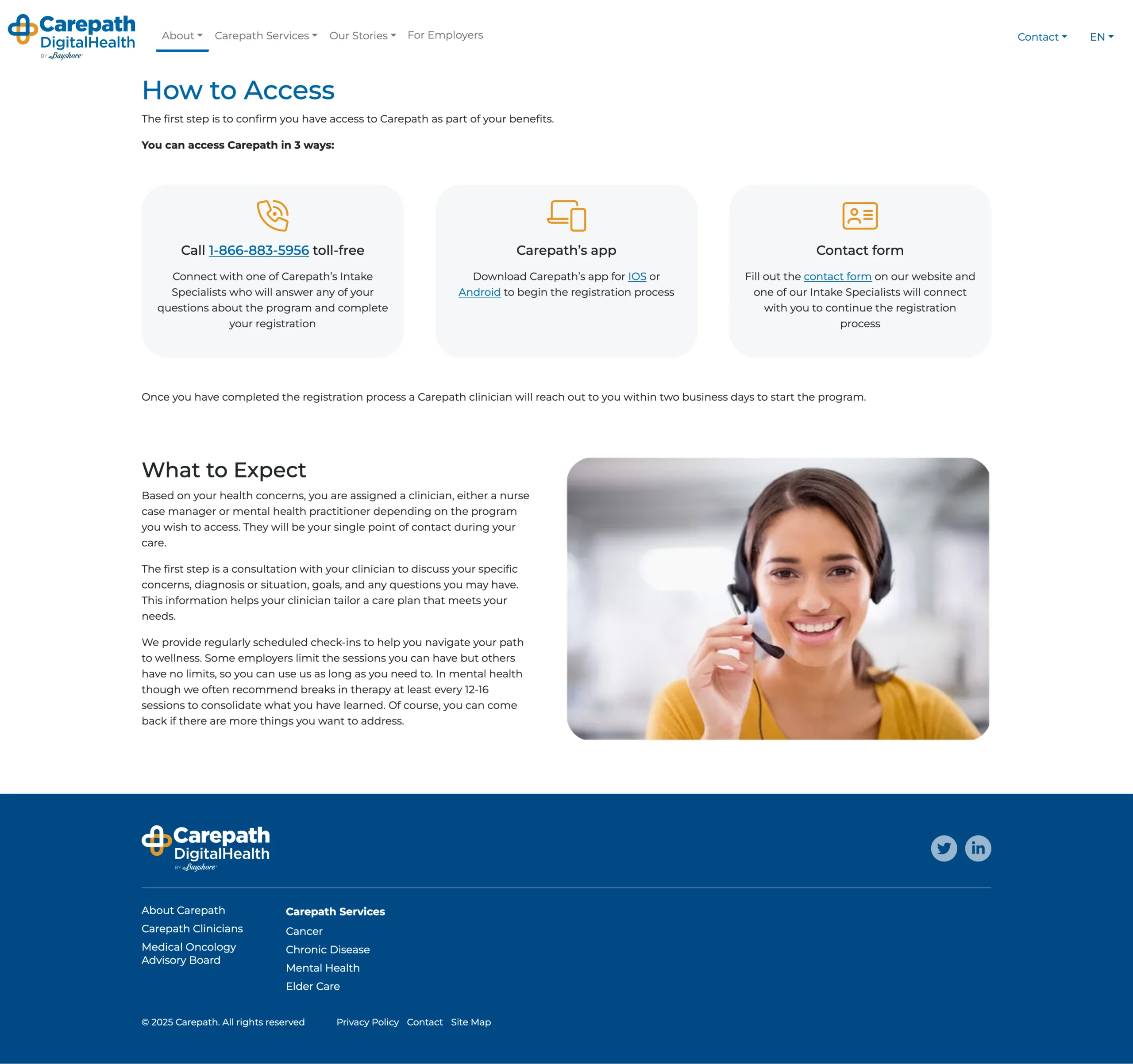
- Easy navigation and clear Calls-To-Action
- Stronger first impression for new visitors
- A responsive layout optimized for all devices
- English-to-French and French-to-English language toggle